An old style font by Robert Slimbach, Minion Pro was originally designed for print. It is part of the Adobe Originals series.
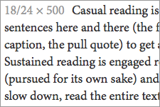
Minion Pro feels “old” and pen-formed. It has a smaller x-height than Georgia, small closed counters on the letters a and e, and relatively small apertures. Thus it needs to be set larger to retain readability. Minion Pro is my favorite print font, and I didn’t expect it to work so well on screen (I usually prefer web fonts with a larger x-height and aperture). I was pleasantly surprised.
Minion Pro comes in 8 styles, including a beautiful semi-bold, which creates hierarchy without getting too heavy on screen. Even though it was originally designed for print, Minion Pro is well hinted and tests well across browsers. It gets a little light on Firefox, Chrome, and Opera on Windows XP, but is still legible if set at a generous size. The whole family is available on Typekit.

