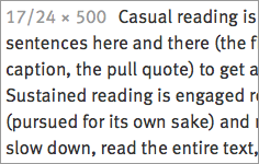
A humanist sans serif font designed by Erik Spiekermann and published by FontShop.
Meta was originally a print font designed for small text. The same elements that helps Meta stay readable at small sizes in print helps Meta Web Pro stay readable on screen: open apertures, a generous x-height, generous closed counterforms, and slightly loose letterspacing. Meta Web Pro is not merely a print font repackaged for web use—it has been carefully hinted and looks great on screen.
Although Meta Web Pro has a decidedly vertical structure, I categorize it as a humanist sans serif due to its double-decker g, the curved stroke on the lowercase l, and its humanist italic.
Meta Web Pro works cross browser. 4 styles are available via typekit. A total of 16 styles are available for license directly from FontShop. It also works beautifully with its companion font: Meta Serif Web Pro.


