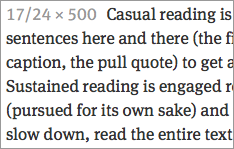
A serif font designed by Erik Spiekermann, Christian Schwartz, and Kris Sowersby. Published by FontShop.
Meta Serif (for print) was originally designed as a companion font to Meta. Meta Serif Web Pro is not merely a print font repackaged for web use—it has been carefully hinted and looks great on screen.
I classify Meta Serif Web Pro has an “Other Serif” font, because it does not fall neatly into any of the general historic categories commonly used to describe serif type. Serifs look more pen-formed, while terminals on the a and f look more drawn. The contrast between thicks and thins is moderate, and feels more old-style, but the stress is decidedly vertical and feels transitional. All of these elements meld gracefully together to create a serif font with a slightly “square” or “structured” feeling. Meta Serif Web Pro’s x-height is only a hair larger than Georgia’s, but retains readability a bit better at smaller sizes.
Meta Web Pro works cross browser. 4 styles are available via typekit. A total of 16 styles are available for license directly from FontShop. It also works beautifully with its companion font: Meta Web Pro.


