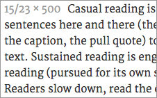
A serif font by Eben Sorkin. I categorize Merriweather as an “Other Serif” font, because it does not fall neatly into any of the general historic categories commonly used to describe serif type.
Merriweather gracefully mixes-and-matches various historic approaches to font design. Head serifs and some terminals feel pen-formed, while foot serifs are reminiscent of delicate slab serifs. It has a large x-height, and generous apertures. It is extremely readable at smaller sizes, and the bolder weights are well balanced and don’t get too heavy on screen. I’ve spent some time using this font this summer, and it is one of my favorite fonts for web text.
Merriweather currently has 4 weights available via google webfonts. Keep an eye on this font as it develops! It’s readable, beautiful, and holds up well cross browser.


