A serif font designed by Jean François Porchez of Porchez Typofonderie, Le Monde Courrier attempts to “re-establish a style halfway between writing and printing.”
First, let me say, I love this font! The overall structure and system (when viewed on Safari, Chrome, Opera or Firefox from my mac) is gorgeous. I want to use it. But I can’t (at least not for extended text).
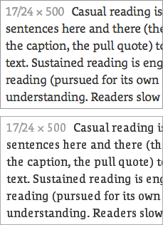
Unfortunately, Le Monde Courrier has slightly uneven spacing at text sizes. For example, look at the word reading (first word, fifth line down) in the top example at left. The space between the e and a is too loose compared to the re and di in the same word. This problem occurs multiple times in text, between a variety of letter pairs.
And, unfortunately, the problem gets worse on Windows platforms (see the lower example at left, a screenshot from Safari). Letters get narrower, blockier, and more loosely spaced. Letterspacing between ed, er, ea, en, and al all get too loose. Granted, the font remains legible, but it loses some of its readability and grace.
I categorize Le Monde Courrier as an “Other Serif” font, because it does not fall neatly into any of the general historic categories commonly used to describe serif type.
Le Monde Courrier gracefully mixes-and-matches approaches to font design. The e, i, and l have italic influence, while most other letters are Roman. It has a large x-height, a single decker g, and an almost monoline stroke — all of which make the font feel more structured. But it also has generous apertures, pen-formed serifs, and an implied stress on the bowls — all which help it feel more humanist.
Le Monde Courrier is an absolutely lovely font originally designed for print. It has a couple of spacing and hinting issues to work out so it can continue to be absolutely lovely on screen. It’s worth keeping an eye on. If we’re lucky, future versions of the font will have better spacing. The web version of Le Monde Courrier has 6 weights and styles.


