Designed by Steve Matteson, Type Director of Ascender Corp.
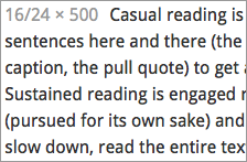
Droid Sans is a humanist sans serif font. Ascender describes it as having “an upright stress, open forms and a neutral, yet friendly appearance.” Its open aperatures, slightly tapered spurs, and a double-decker g all make Droid Sans feel slightly more hand-written than manufactured. It has a slightly narrow bowl and an x-height that’s only a hair shorter than Verdana’s. Droid Sans also has a generous letter spacing, which makes it easier to read at small sizes, but can make the letters feel a little “loose” when used for headlines.
Droid Sans comes in regular and bold.


