Minion Pro

An old style font by Robert Slim­bach, Min­ion Pro was orig­i­nally designed for print. It is part of the Adobe Orig­i­nals series. Min­ion Pro feels “old” and pen-formed. It has a smaller x-height than Geor­gia, small closed coun­ters on the let­ters a and e, and rel­a­tively small aper­tures. Thus it needs to be set larger […]

Continue Reading
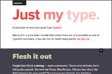
Just My Type

If you’re look­ing for new ideas for pair­ing web fonts, check out Just My Type by Dan Eden. The site rec­om­mends font pairs using fonts from TypeKit’s col­lec­tion. I can­not guar­an­tee that all web fonts shown are per­fect (I don’t know if they’ve all been tested cross browser for instance), but the pair­ings will cer­tainly […]

Continue Reading