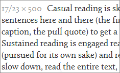
A font that almost made it. A Venetian serif font by Jos Buivenga (exljbris.com), Calluna has a smaller x-height than Georgia, and works best at a generous font-size. Calluna feels like an “old” font; it has pen-formed serifs and terminals. The rising crossbar of the lowercase e is reminiscent of early Renaissance (Venetian/Humanist) letterforms.
Unfortunately, the font does not hold up across browsers. On Windows (XP, 7, Vista) the strokes on the letterforms get very light (thin). The pen-formed head serifs on letters such as h, b, d, u, and so on become too prominent, and the rising crossbar on the e becomes jagged and breaks.
The overall structure, spacing, and system of the font is beautiful. I had to include it in my collection anyway. If you are creating a site primarily for mac users, Calluna will serve you well.
The Calluna family consists of 8 fonts (styles, weights).


